


-
Responsive Website
Responsive web sites are an excellent manner of creating your website mobile and tablet friendly. A responsive web site style is coded to regulate to totally different size screens that your visitors are going to be viewing your web site on.
-
.jpg)
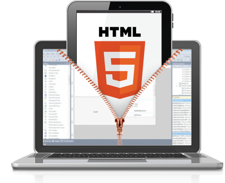
Responsive Designing :: Web Designing :: Web Development Company Coimbatore, Tamilnadu in India
A responsive web site uses advanced programming technology to form a wonderful viewing expertise. By creation use of solid style and making your website to retort optimally to the scale of the screen it's viewed on, it'll look good regardless of the surroundings - be it iPhone or giant desktop monitor.
At A2ZWAY iTECH we take a 'mobile first' style approach, permitting us to use the key requisites before going in the moving content once the screen size permits. This style method let us work from smartphones to tablets to desktop monitors, which means regardless of what configuration of screen displays your web site, you'll be able to be one hundred assured it'll look attractive.
Why Choose A2ZWAY iTECH for Responsive Web Design ?
- Highly proficient developers who have interest knowledge and experience in responsive web design
- We couple advanced technologies like CSS3 and php5 to make best-in-class responsive designs that look equally likable and enticing across multiple devices
- Custom responsive web design services
- Complete web site designing from scratch or web site re-designing to create it responsive across all devices and screens
What Challenges/Problems Does Responsive Web Design Solve?
- Upgrade the mobile and tablet viewing expertise of your web site visitors - no vertical or horizontal scrolling.
- No separate websites to be designed and maintained for mobile users.
- Fluid grids work as an extension of liquid layouts - albeit during a a lot of sturdy manner fitting components into vast and little screens effortlessly.
- We provide Drupal and Wordpress based content-managed responsive sites.
Is Responsive Web Design the future?
Definitely affirmative. Technologies comparable to Flash became outdated and also the web is moving towards standard-driven web development approach that develops php5 and CSS three for developing and planning websites.
We are artistic responsive style terribly low price and reasonable price in India.
For websites that have already got a mobile version, it is sensible to travel responsive too because the want of managing 2 separate sites can now not be there.
